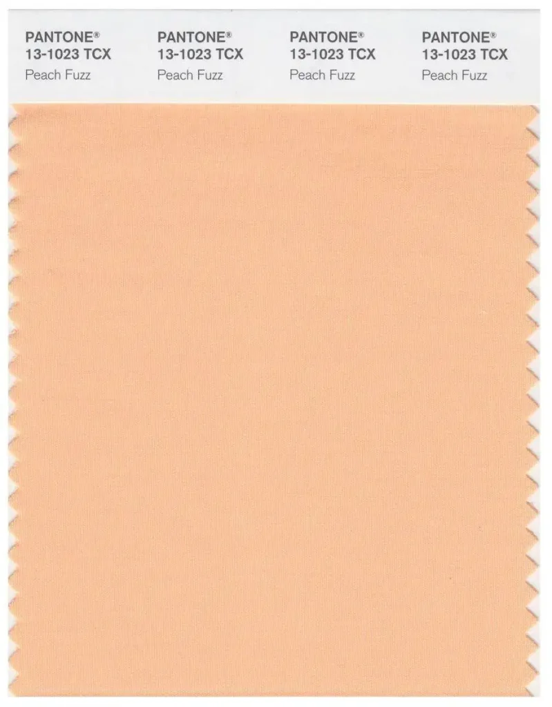
The annual PANTONE Color of the Year has finally been revealed for 2024. This year, we welcome the gentle Peach Fuzz (13-1023).
It’s a velvety, gentle peach color, situated between pink and orange.
In the Korean drama ‘Goblin,’ it’s said: ‘Today you’re lucky to meet such a tender-hearted deity.’
The sweet and soft Peach Fuzz also wishes to offer us a warm embrace during our winter days.
1. The peach color, which feels touchable, why can it represent the year 2024?
Since 2000, the global color authority PANTONE has been selecting a color every year to represent the spirit of the current era and to drive its influence across various industries, becoming popular worldwide.
With wars, celebrity deaths, and artificial intelligence, 2023 was a year filled with uncertainty. We were on edge, more concerned about ourselves.
Color became a mirror of emotions, with dopamine prevalent in spring and summer, while metachromatic tones rose in autumn and winter. The Color of the Year for 2024, assigned by PANTONE, also carries a similar mission:
“I’m angry, what can make me calm down?
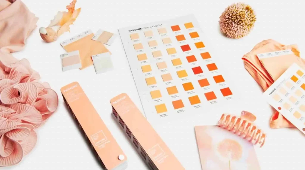
The final chosen “Peach Fuzz” is a gentle peach color, light and airy like a dandelion.
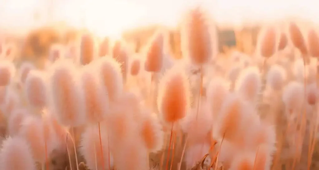
Seeing it, you might recall peaches, feathers, silk, blankets, blush, or even the colors of the sky during sunrise or sunset.
“Peach Fuzz” reminds us to listen to ourselves, to relish the tranquil moments of solitude.
Simultaneously, “Peach Fuzz” also calls forth love at the core of the universe, embodying the sentiment of “Seeing the person in your dreams, waking up to meet them” from “My Sassy Girl.”
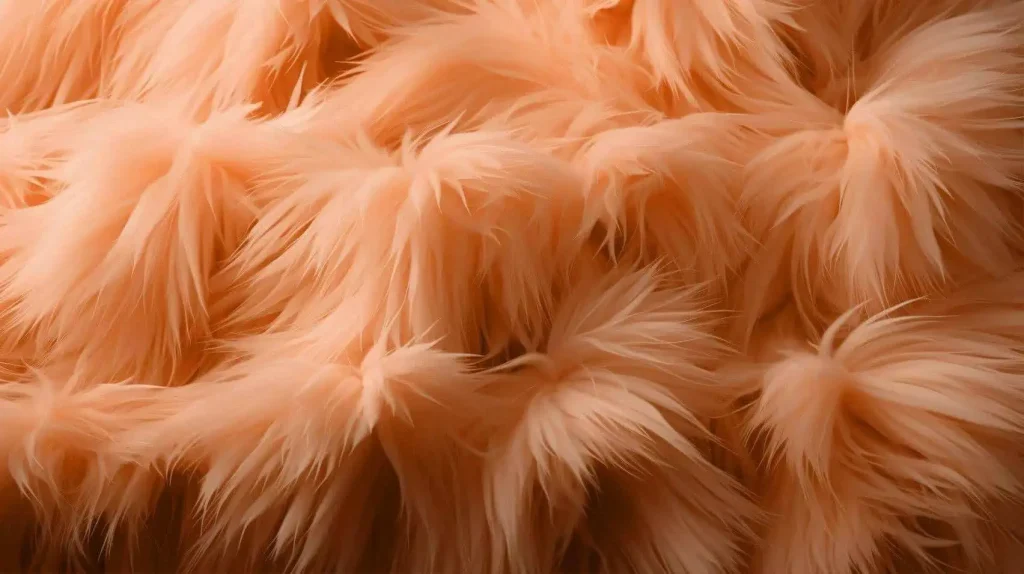
You feel an urge to reach out and touch this color, which is a crucial aspect of our perception.
As stated by PANTONE, the soft, fuzzy texture of Peach Fuzz instinctively prompts us to reach out and touch, reminding us to detach from two-dimensional screens and connect with others face-to-face in reality.
Pink is traditionally considered a color associated with femininity, but it has now also been incorporated into men’s wardrobes. An example is Dwayne “The Rock” Johnson’s tuxedo jacket at the 2023 Oscars ceremony.
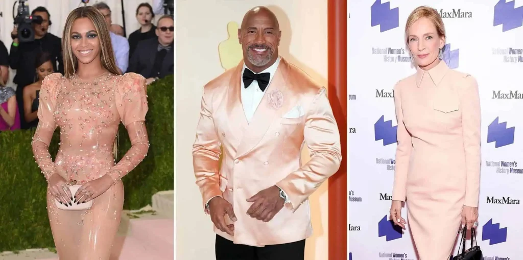
So, in this constantly noisy era of the internet, Peach Fuzz also aims to evoke inclusivity and empathy among people, moving towards a more love & peace-oriented future.
When choosing for 2024, we noticed that having a fulfilling life, amidst a world that emphasizes productivity and achievements, involves having health, patience, and resilience.
Of course, the Color of the Year is not content with just being a concept; it’s also a business aimed at the public.
As usual, PANTONE has released limited edition merchandise like mugs, keychains, and a range of collaborative products with other brands for the Color of the Year 2024.

Old friend Motorola is once again in the spotlight. Last year, they presented a magenta-colored phone, and this year, it’s a Peach Fuzz-colored phone. Crafted using soft vegan leather, they claim it offers an incredibly smooth touch sensation.
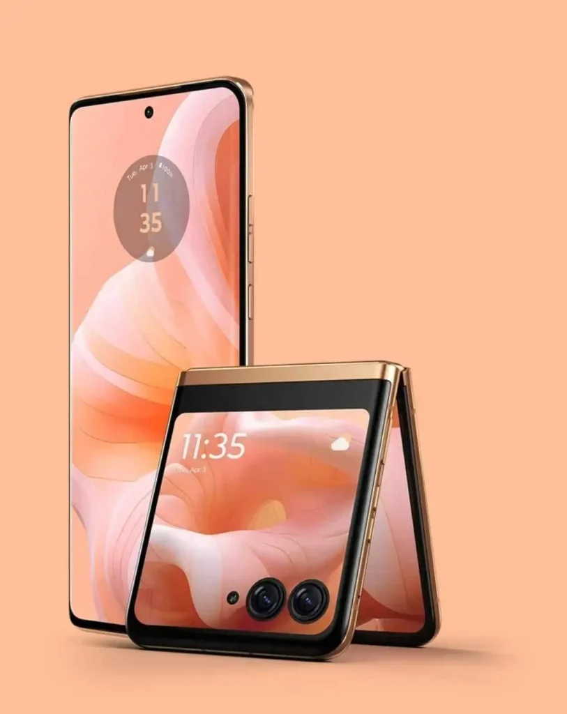
However, this phone seems to be a bit challenging to handle—not about skin tone but about personality. Even PANTONE states, “Suitable for individuals with strong style and outgoing personalities.” As an introverted person, I’ll just have to take a pass on this.
Polaroid also pleasantly joins in this time, releasing a limited edition i-Type instant film pack, allowing photography enthusiasts to capture and cherish warm moments spent with others.
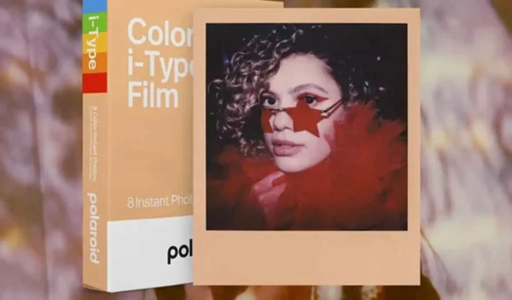
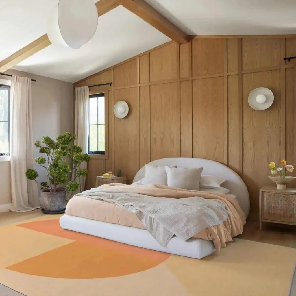
Additionally, there’s Spoonflower’s wallpaper, Ruggable’s carpets, and Shades by Shan’s cosmetics… all focusing on a mantra we can all resonate with enveloping everything in our lives.
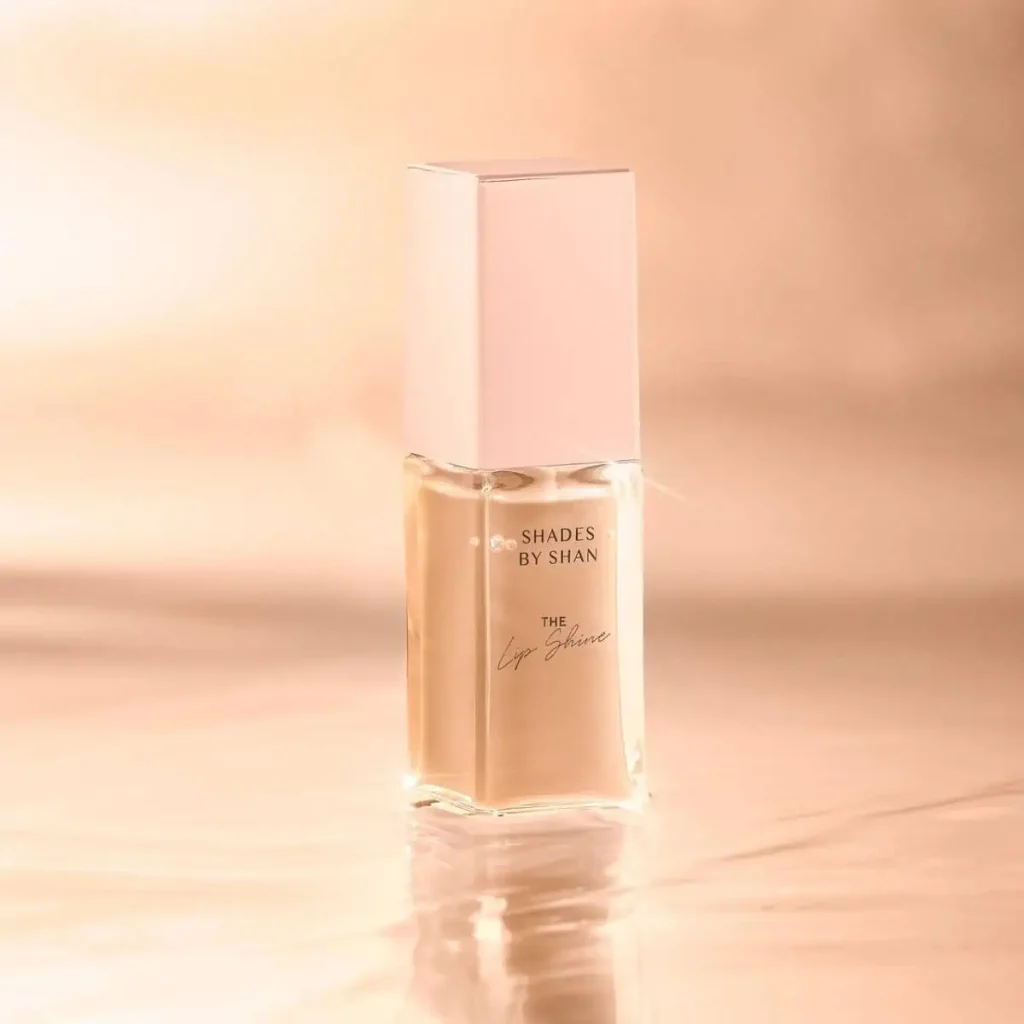

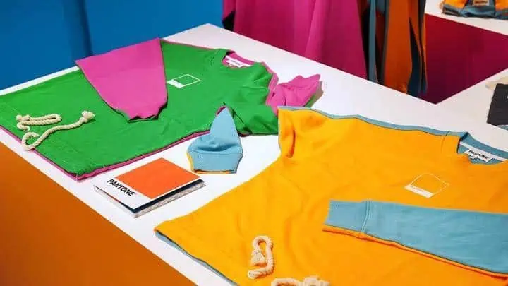
To evoke more senses through color, PANTONE has invited several artists this time. This effort enables Peach Fuzz to circulate within the prints of clothing designers, the atmospheric music of sommeliers, and the emotions of artists.

PANTONE also suggests that everyone can participate in activities inspired by “Peach Fuzz,” such as watching sunsets, attending art classes, joining book clubs, or chatting while walking with friends…
In narrating stories and showcasing how color can be brought to life, PANTONE sets an example. In recent years, it has continuously engaged in “color crossover” to play creatively—developing apps, releasing magazines, opening hotels, starting coffee shops, and more, engaging with the younger generation.
It’s hard to say whether PANTONE is predicting trends or actively shaping them firsthand.
2. Using Pantone color as a language to influence the world
For PANTONE, the Color of the Year for 2024 holds a slightly different significance. The announcement of Peach Fuzz signifies the 25th anniversary of this series.
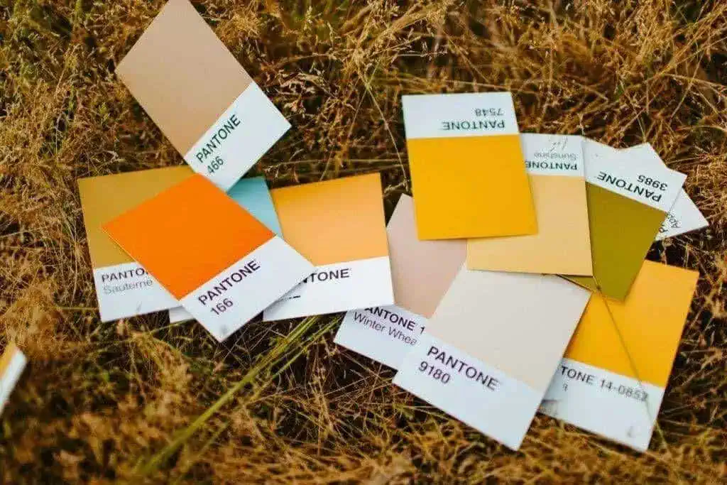
Every year, they dispatch a team of 10 individuals to travel around the world, dedicating an entire year to observing and seeking color inspiration from various cultural perspectives like food, automobiles, fashion, home goods, and more.
Capturing the spirit of the times with a specific color and aiming to influence product design and consumer aesthetics is an ambitious endeavor—not one that everyone will necessarily embrace.
However, PANTONE has persisted with this initiative for over 20 years. Capturing a subtle collective sentiment amidst chaos and anxiety seems to be its comfort zone.
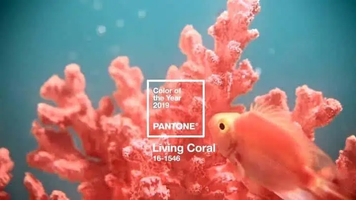
The vibrant “Living Coral” in 2019 represented concerns and vigilance regarding climate change. It also evoked warmth, reassurance, and intimacy amidst change, much like how coral reefs nurture marine life.
The refreshing “Greenery” of 2017 echoed the greenery in everyday life, offering hope to people navigating through tumultuous societal and political environments.

In addition to the recently announced Color of the Year for 2024, PANTONE also released the Spring/Summer 2024 color trend report in September this year. This report specifically focuses on the popular colors seen at New York Fashion Week and London Fashion Week.
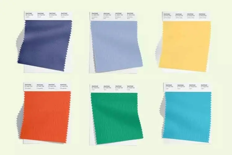
I must admit, PANTONE has a knack for naming colors: National Treasure Tea Red, Mandarin Orange, Watercress Green, Desert Pollen Pink, Quimper Blue, Lilac Pink, Marine Blue, Lemon Drop Yellow, Mint Green, Capri Blue…
Even with an expanded selection, the essence remains consistent with Peach Fuzz: “The desire for personal expression remains at the core of fashion.”
In 1965, PANTONE released its first color-matching system designed for artistic materials. Later, PANTONE incorporated color systems for pigments, plastics, powder coatings, screen technology, and textiles, establishing the most universally recognized color language.
Colors, in the form of standardized codes, circulate among human designers. In the natural world, colors emerge audibly and visually. Color itself serves as a means of communication, transcending gender, generations, and geography.

Representative color institutions like PANTONE have imbued colors with more concepts, elevating them to the level of spiritual needs. Yet, for most people, sometimes it’s simply about the initial impression.
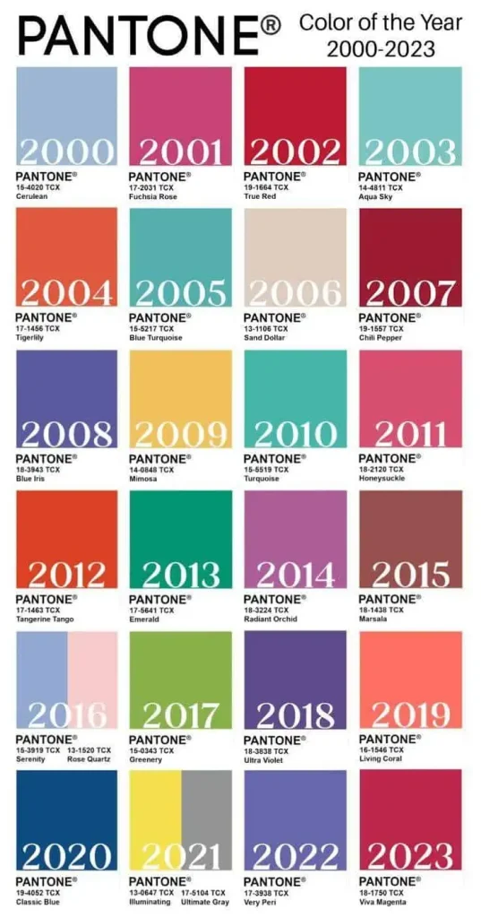
PANTONE’s first Color of the Year was Cerulean Blue in 2000. The color resembled the crystal-clear sky on a bright day, echoing the hope for the future during the millennium.
In an era of rapid technological advancement, aesthetics are simultaneously reverting to retro styles. If the year 2000 symbolized embracing the unknown, 2024 quietly reflects inward. Our emotions need gentle support, and perhaps, that’s the essence of Peach Fuzz.


[…] 2024 PANTONE Color Unveiled: Healing Hue for 2023 Chaos […]